design application
for desktop
OVERVIEW
TASKS Ideate design solutions for upcoming features in the product road map in a Agile environment. The features assigned to me were Group/Ungroup function and Reorder Layers function. I also provided ideas for the Layers section redesign and designing custom iconography.
ROLE UI Designer working with Product Manager, UX Designer, and Front-end Developer
TOOLS Sketch, Zeplin, Confluence for requirements documentation
APPROACH
Working with the Product Manager and UX Designer, I familiarized myself with the product requirements and user goals. I asked questions to certain requirements that were missing details and provided feedback on how to improve the overall design. The feedback included the length of keyboard shortcuts, interaction within other areas of the design app after an action is active, and the visual design of elements when actions are active. I suggested the keyboard shortcuts be similar to other major design applications and keep in mind the length of the shortcut. Four plus characters for a shortcut was excessive especially for users who haven’t used a design tool before. The requirements didn’t include interaction details of how other elements and sections are effected with a certain action occurs. I was able to collaborate with the Product Manager to improve the product requirements for these functions.
OUTCOME
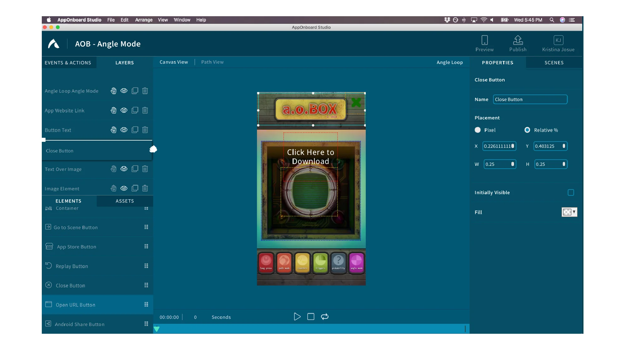
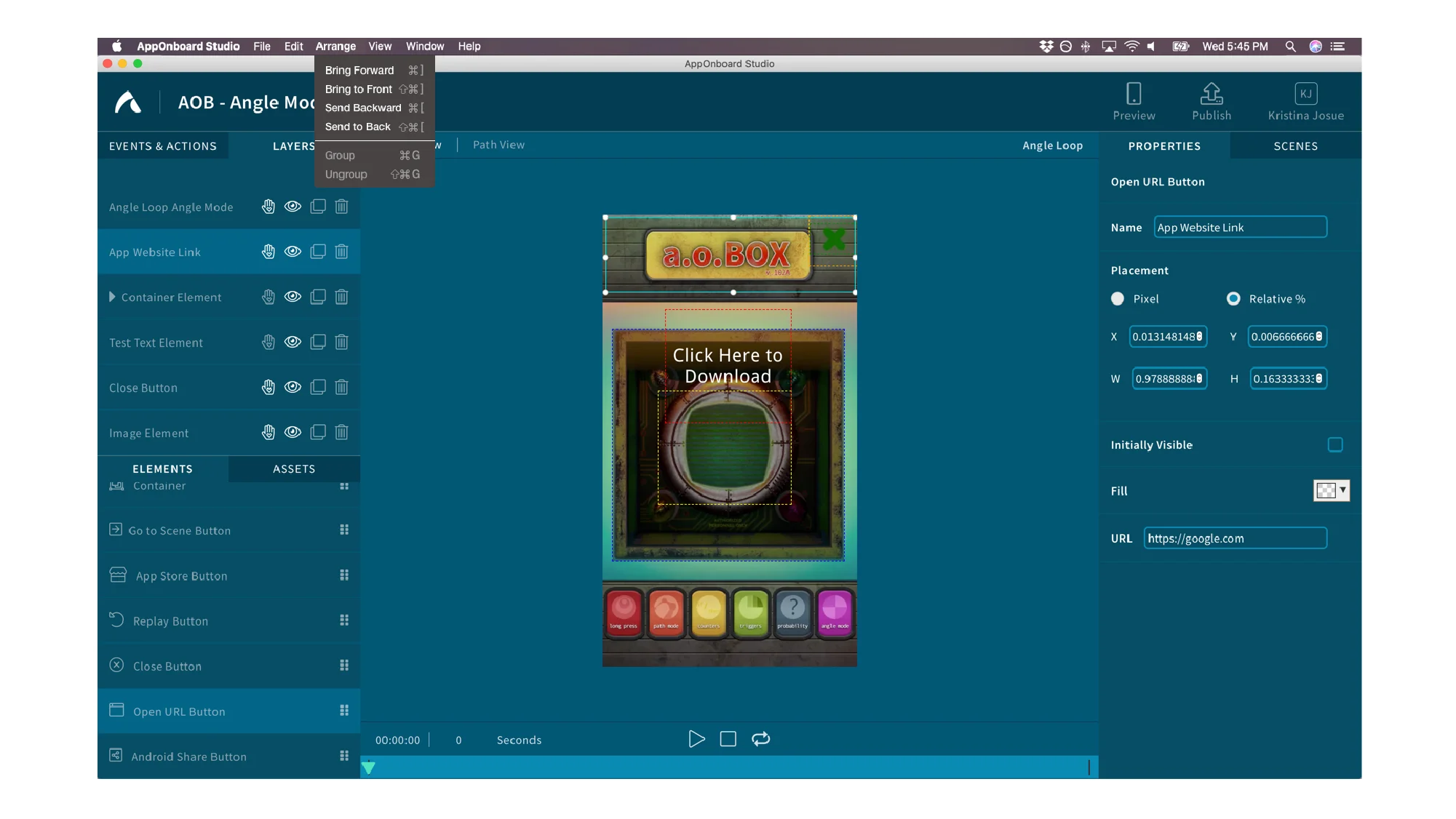
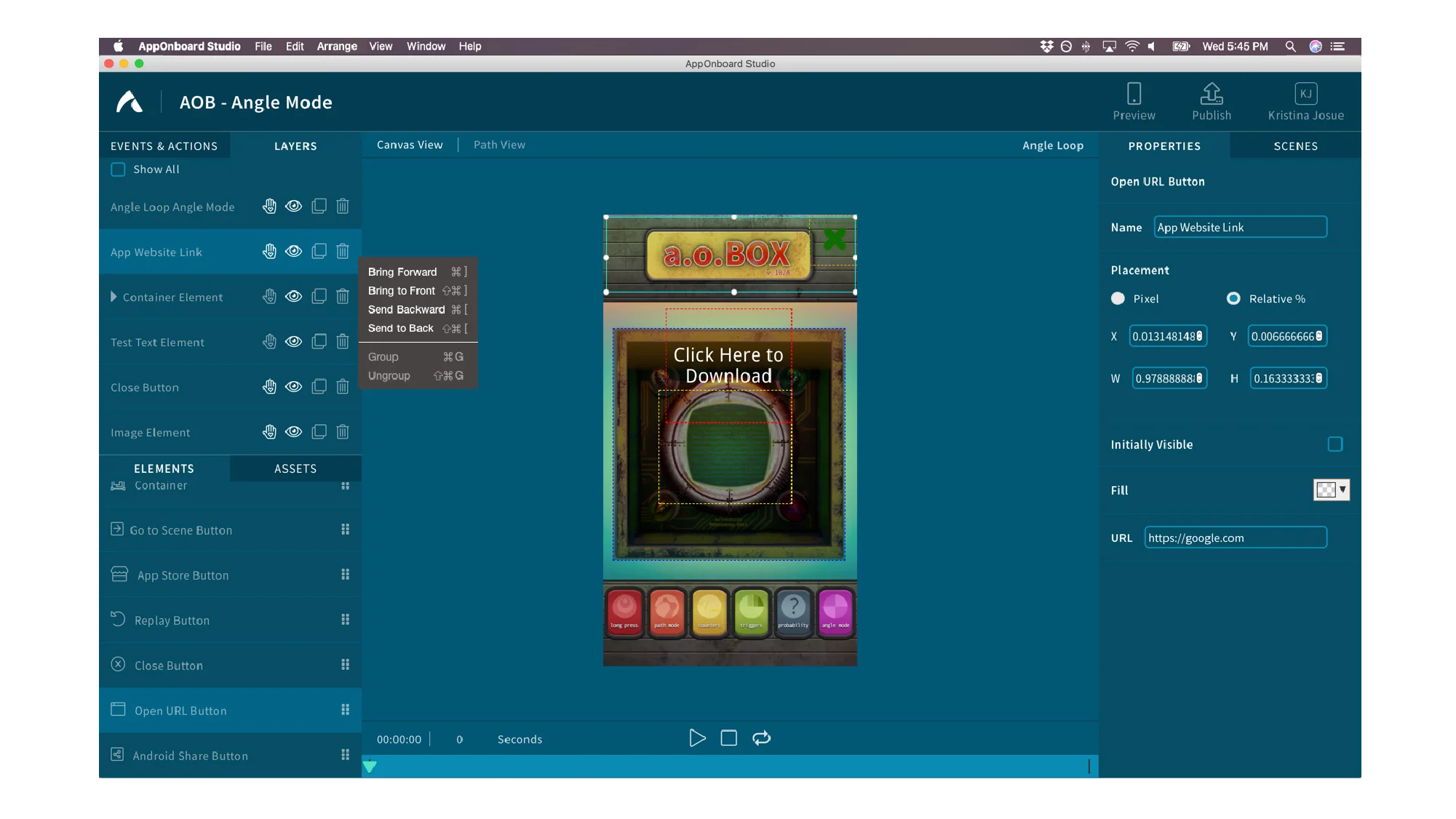
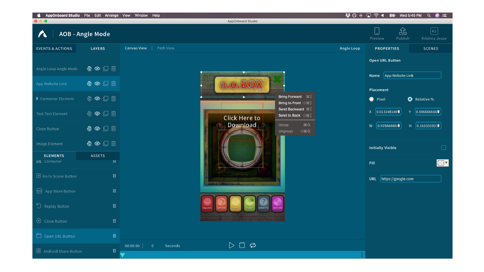
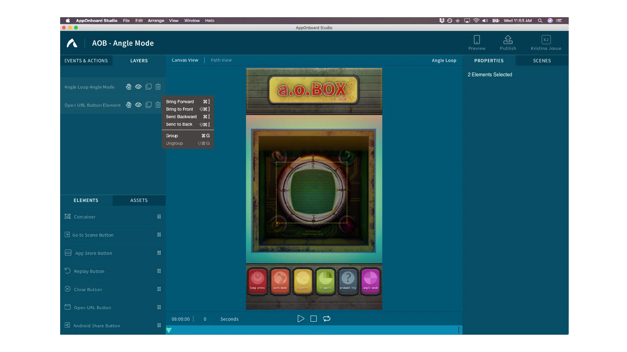
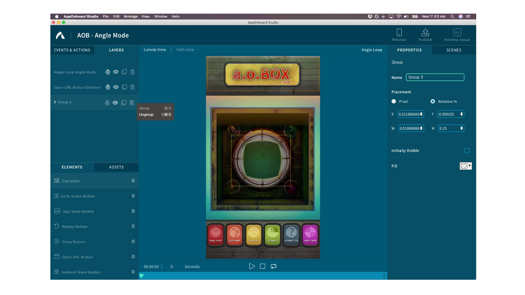
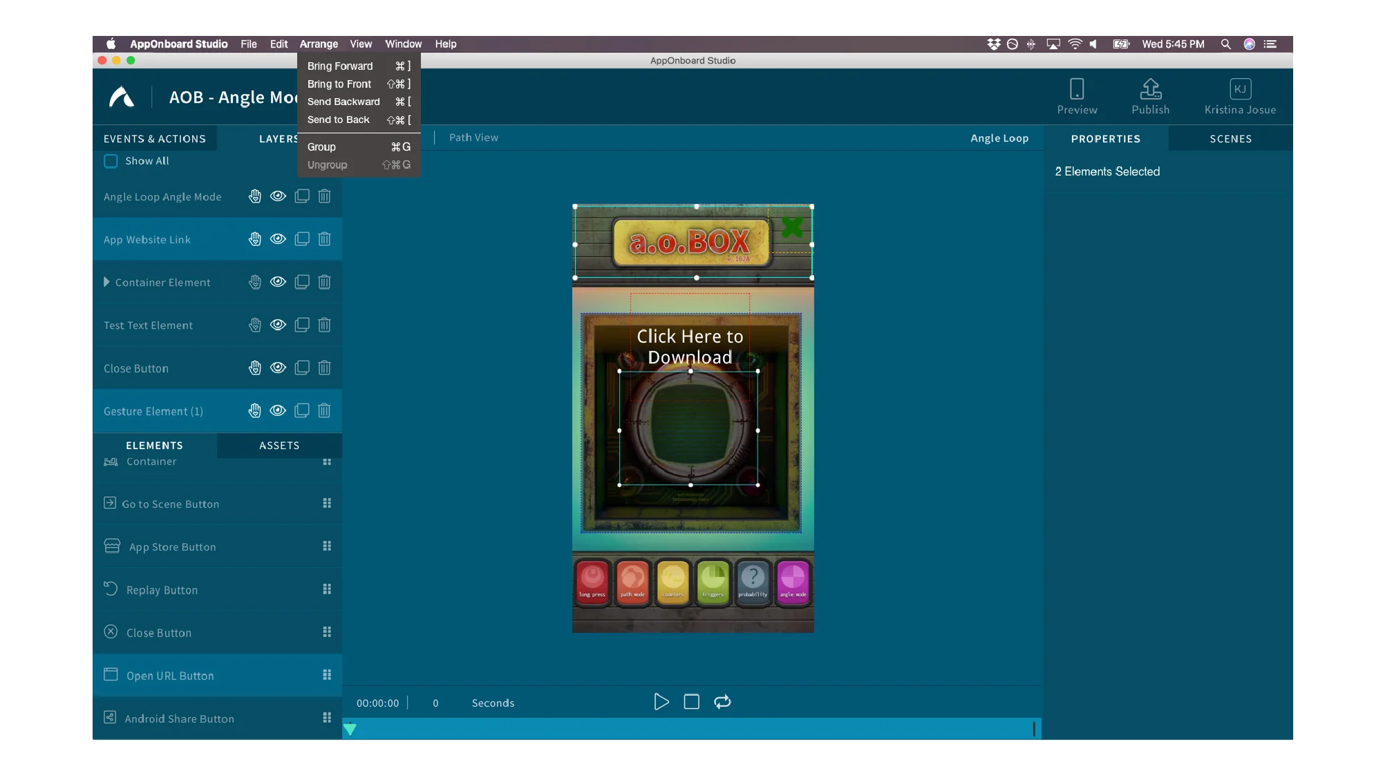
Below are designs that are currently deployed into the current design application. Within two sprint, the team was able to implement the Group/Ungroup function and Reorder Layers function. The Layers section redesign and custom iconography have not been implemented.
REORDER LAYERS
GROUP AND UNGROUP
LAYERS REDESIGN
Based on user feedback, the Layers panel brought the highest confusions with understanding the actions and the functionality of the icons. Users were confused on what some icons mean and what icons did after clicking on them. Users were also disappointed on the limited actions one had. As a new user with fresh eyes and perspective, I was tasked to provide new ideas of how to make this section more user friendly and intuitive to users who aren’t designers or developers. In order to make this section easy to use, I did market research on design tools that are made for non-designers and I also tapped in on the common functionalities across the design heavy tools such as the Adobe Creative Suite. After evaluating user feedback and market research, I created mockups of the ideas I had and was able to show these ideas to the product and engineering teams.
CUSTOM ICONOGRAPHY
When I did a design audit of the whole application, I notice a lot of inconsistencies when it came to the style, stroke weight, and size of icons. I also noted that some icons didn’t depict the action associated with them and users have voiced confusion with when interacting with those icons. I was tasked with the responsibility to ideate and design the custom iconography for the design application. I started off with doing a market research comparison to see the design of common icons of popular actions such as delete, upload, add, play etc. Within a month, I was able to complete one round of designs and present my work to the senior product designer.
END


